
Over the years, I’ve been involved in quite a few projects where the client asks for the “supermap”. It normally goes like this: “Can you show us what a,b,c…z look like, and can it be on maps, and we want the information to be compared on the same map.”
These requests can often feel hodgepodge and cumbersome; to the point you’re not sure what to do with the information. They tend to come as a result of some form of consultation or engagement where “key criteria”, “drivers”, or “target groups” have been identified. While there are a lot of ways to make a supermap (some Bizarros floating around too), I’ll be sharing one that I find helpful when initially probing the data.
I call these “proportionally dominant characteristic” maps. These are a variation on Predominance Maps, which are typically used to display dominance by sub-groups of single characteristics. Familiar examples would be showing what age or ethnic group is largest, or what level of education attainment is most common in an area.
The proportionally dominant map steps outside of a single character group, and tries to show dominance between different characteristics, as opposed to subgroups.
For my chosen example, I’ll be using Wellington census data that was lying around my hard drive. I (somewhat) randomly chose 9 meshblock indicators for my characteristics (that a made-up stakeholder group decided were important for understanding Place Making and Spatial Planning in Wellington). The characteristics are:
- People Aged over 65,
- People with College Education,
- Families with Children,
- High Income Households,
- Owned Homes,
- Labour Force Participation,
- One Person Households,
- Rented Dwelling, and
- Volunteers
While standard predominance may work to compare something like Home Ownership vs Renting, it will not work out of the box for Home Ownership vs Volunteers. You may wonder, “can’t we just normalize everything as a percentage or rate of population, and compare that?”
Short answer, “maybe.” Long answer, if we can assume the rates/percentages have similar distribution, then perhaps. But typically the distribution of different characteristics can vary widely. For example (user warning, made-up stats follow) Home Ownership may range between 35% and 95% averaging 65% and volunteerism may range from 0% to 50% averaging 15%. In this case, Home ownership would likely noise out volunteerism in most cases. We don’t want that, we want to know where the rate of volunteerism is outstanding compared to the rate of Home Ownership.
So this finally gets me to the meat of my method; using proportions. First, this method has two basic assumptions:
- that all the characteristics have a common relationship with an explanatory variable, and
- in this relationship, the characteristic scales linearly (ish) with that explanatory variable.
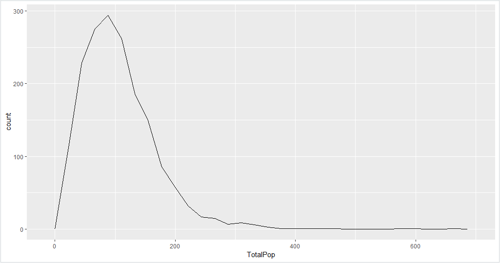
I look at my characteristics and think, “something all of these seem to have in common is that they depend on the size of population in an area.” I look at my distributions of populations by meshblock and see that most meshblocks are between about 50 and 300 population in Wellington. (Note, I don’t actually plan to use population for any calculations; I’m just using it to check my assumptions.)
I then chart each characteristic against meshblocks with population between 50 and 300. While the chart on the left shows a lot of variation, the trend for each characteristic seems positive. I confirm this by smoothing the lines in the right chart. The lazy statistician says, “looks linear to me” and moves forward. The chart on the right also highlights the issue of using predominance. Labour Force Participants have a notably high count compared with the other indicators. If we were to select by the actual value or something derivative of actual value (percent, ratios, etc.), labour force would mostly come out on top.

We’re now to the point that takes a little more effort; calculating the proportions of each characteristic for each meshblock. Or in words, for each characteristic we will need take the observed value for a meshblock and divide by the sum of observed values for all meshblocks.
For example, if the meshblock had 30 volunteers and there were 5000 volunteers in all of Wellington’s meshblocks, the proportion would be 0.006 (0.06%) of all volunteers. The charts bellow show the proportional results for all characteristics. As you can see, the distributions are now scaled in a way that is more comparable. The smoothed lines in the right chart largely overlap, while the actual values on the left show where characteristics stand out against each other in the meshblocks.

With the proportional values calculated, they can be joined to a map of the meshblock. The GIF below cycles through each of the characteristics looks like for meshblocks in the Wellington area.

The last step of this process is to create the supermap. In this case, our supermap is comparing the proportional scores for all 9 characteristics in each meshblock and finding the one which is largest. This can be accomplished by creating and calculating a new field, or by using the arcade predominance formula in symbology (my chosen method). The results are shown bellow.

Now is the part where we ask “ok, that is cool, but what do we do with it?”
1. Validating Assumption:
Planning and strategies work around a lot of assumptions, assumptions that are founded on experience or professional intuition. We will all say at some point in our careers “I’ve done a lot of work in that area, and I know that ________ is the biggest issue.” Anecdotally we know _______ to be true, but if we are going to do proper project development it needs a bit more evidence base. This map can help to validate such assumption or show where they may need to be re-evaluated.
2. Prioritization and Strategic Intervention:
In some cases this map may be enough to meet the needs of your client or project. Say the characteristics were related to strategic interventions. Areas highest in Characteristic A. will use strategic Intervention 1.; Areas highest in Characteristic B. will use strategic intervention 2; and so forth. We now have a map that shows what the most dominant characteristics are located.
3. Foundation for Further Analysis:
With most of my work, a map like this is only a starting point. It may be used to help me conceptualize the issues spatially before moving on to a more detailed analysis. What is more, the proportional figures can be used to create new formulas to regroup and reclassify different areas.
For instance we could re-class the meshblocks based on the complexity of apportioned scores (areas low in most characteristics to areas high in several characteristics). We could then know which areas may require more complex interventions.
Or, we could group areas that are high in specified shared characteristics. As an example, we may want to have a special strategy for areas that are proportionally high in families with children and rental homes. We can build a formula to create a new score for areas highest in both. We could even take it a step further and start using machine learning techniques to perform cluster analysis to define and classify the sub-areas.
To close this post off, I’ll say this is just one of many ways to cut data spatially. In my job I am constantly exploring new ways to visualize data to help myself and others understand place. Hopefully I will get a chance to share other methods, maybe even create some samples of a more advanced analysis.


